Background
Constella began as a developer-built MVP for spatial note-taking: capture ideas as cards on an open canvas, connect them, and use semantic search and AI to resurface related knowledge. The ambition was strong, but the product, mobile activation and launch story had evolved separately, making the experience feel more like a collection of features than one coherent knowledge system.
As Founding Product Designer, I worked with the founders and engineering from November 2024 to October 2025 to shape the product into a clearer, market-ready spatial AI experience. My scope covered the desktop canvas and information architecture, semantic search and Stella AI, mobile onboarding, login, pricing and capture, the handwritten-note scanner, reusable design-system patterns, launch-page storytelling, implementation review and design QA.
Core Problem
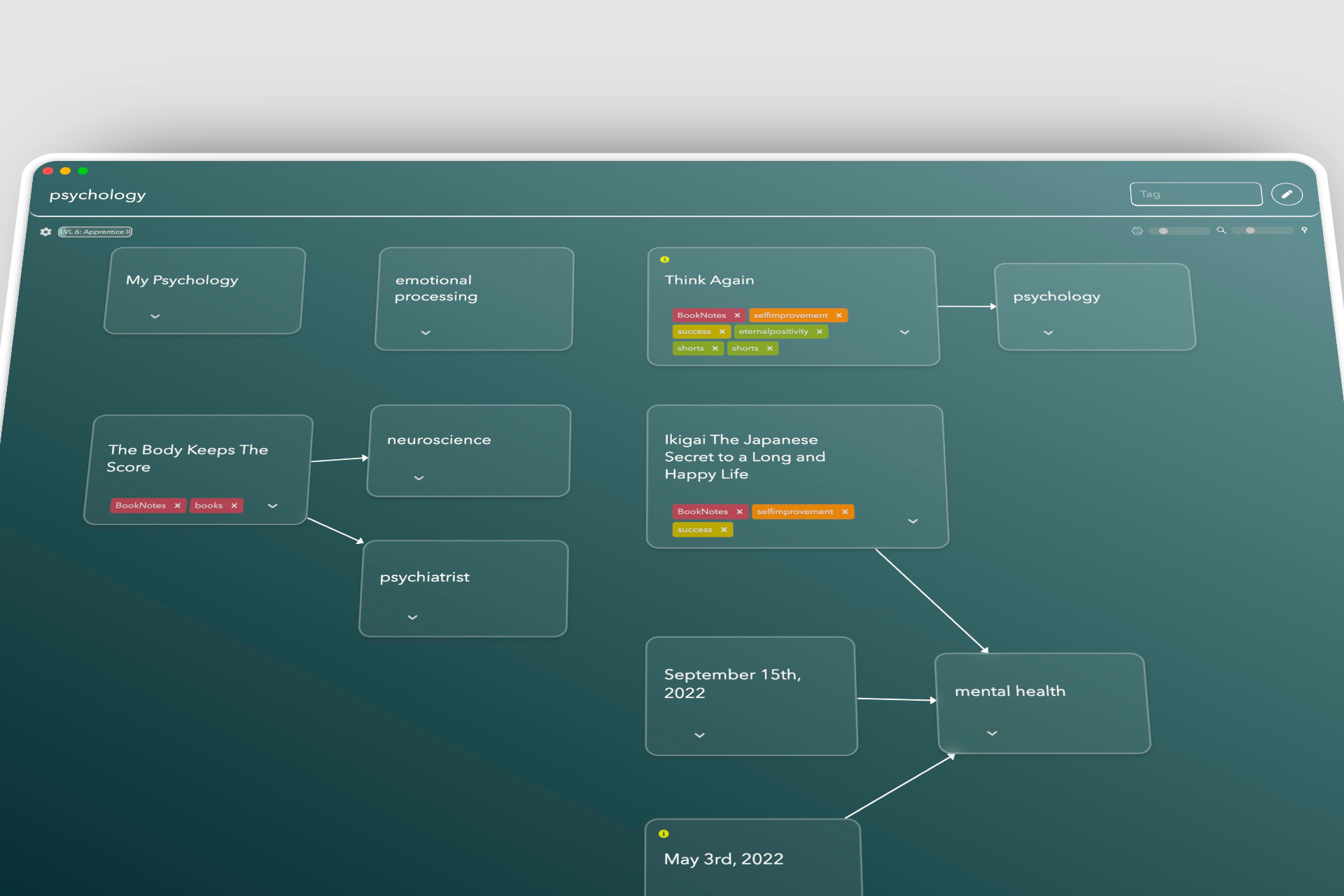
The product was supposed to give people room to think, but the canvas had too many persistent menus and competing controls. Search was powerful but buried, AI occupied too much space, every action looked equally important, and card movement and relationships did not feel natural. New users also had to understand the product, authenticate, choose a plan and capture their first idea across a separate mobile experience.
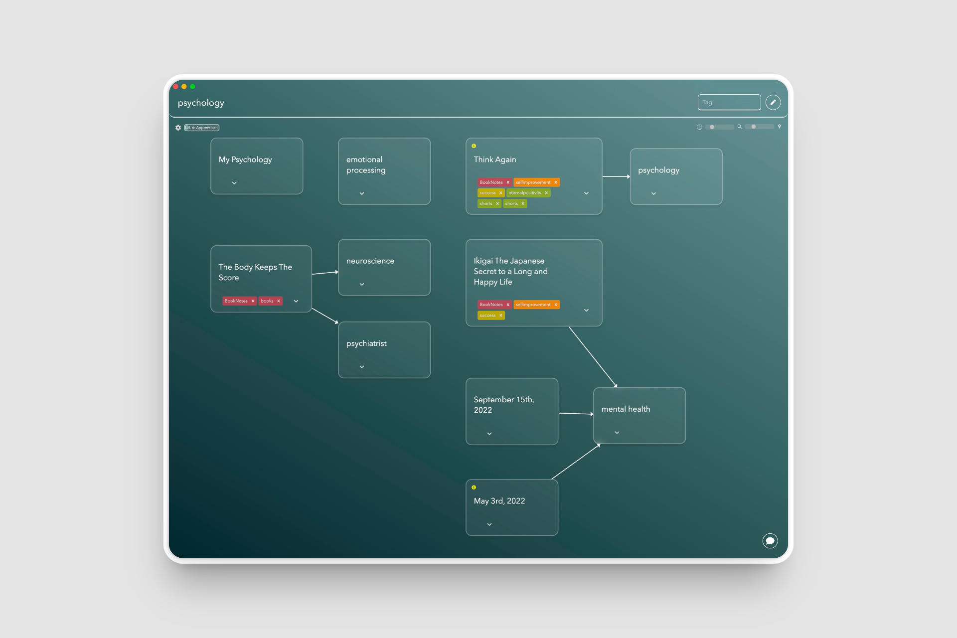
The challenge was broader than visual redesign. I needed to define a consistent product model across desktop, mobile and web: keep the canvas calm, reveal controls only when useful, make search and AI feel native to thinking, turn mobile into a focused capture companion, and communicate the same promise on the public launch page.
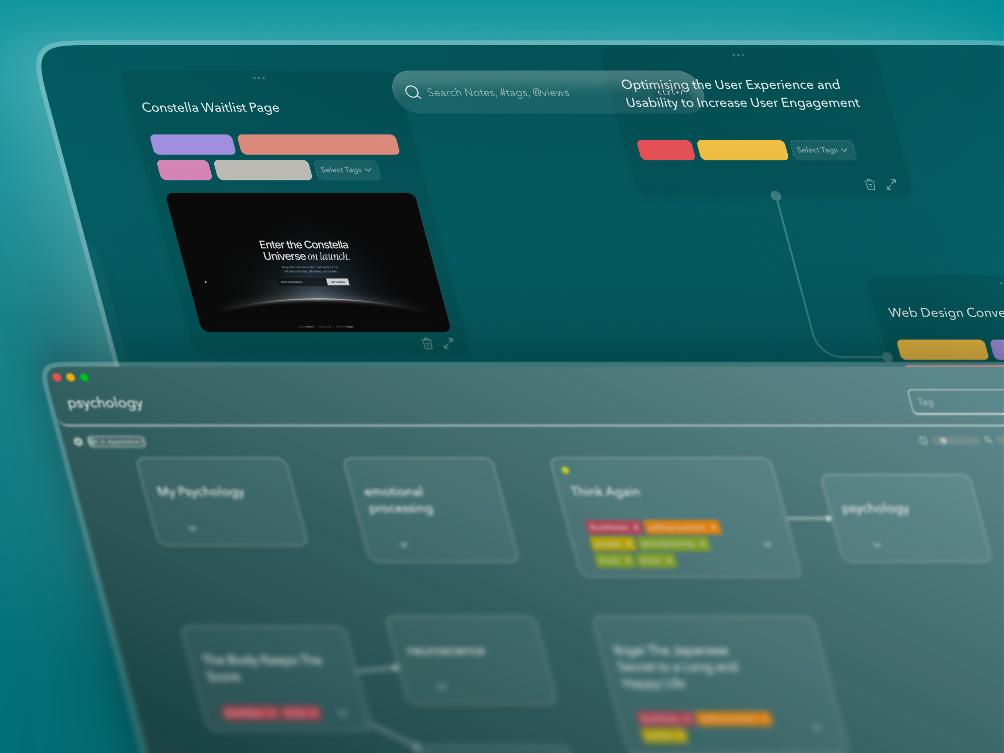
Constella is not a document editor with an AI layer. It is a spatial thinking environment where ideas can be captured, moved, connected and rediscovered. I used that principle to decide what should remain visible, what should appear contextually and which workflows deserved the centre of the product.
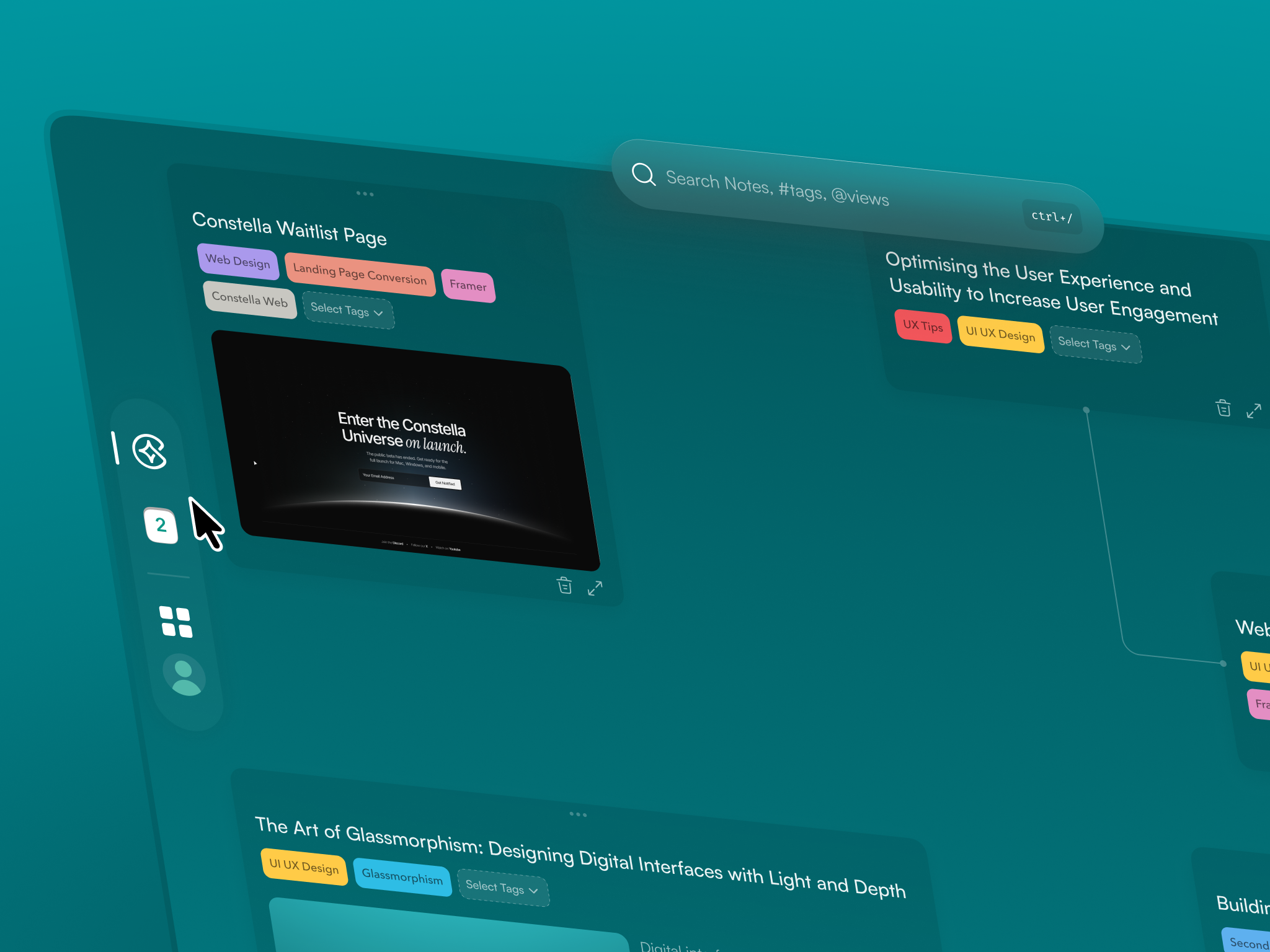
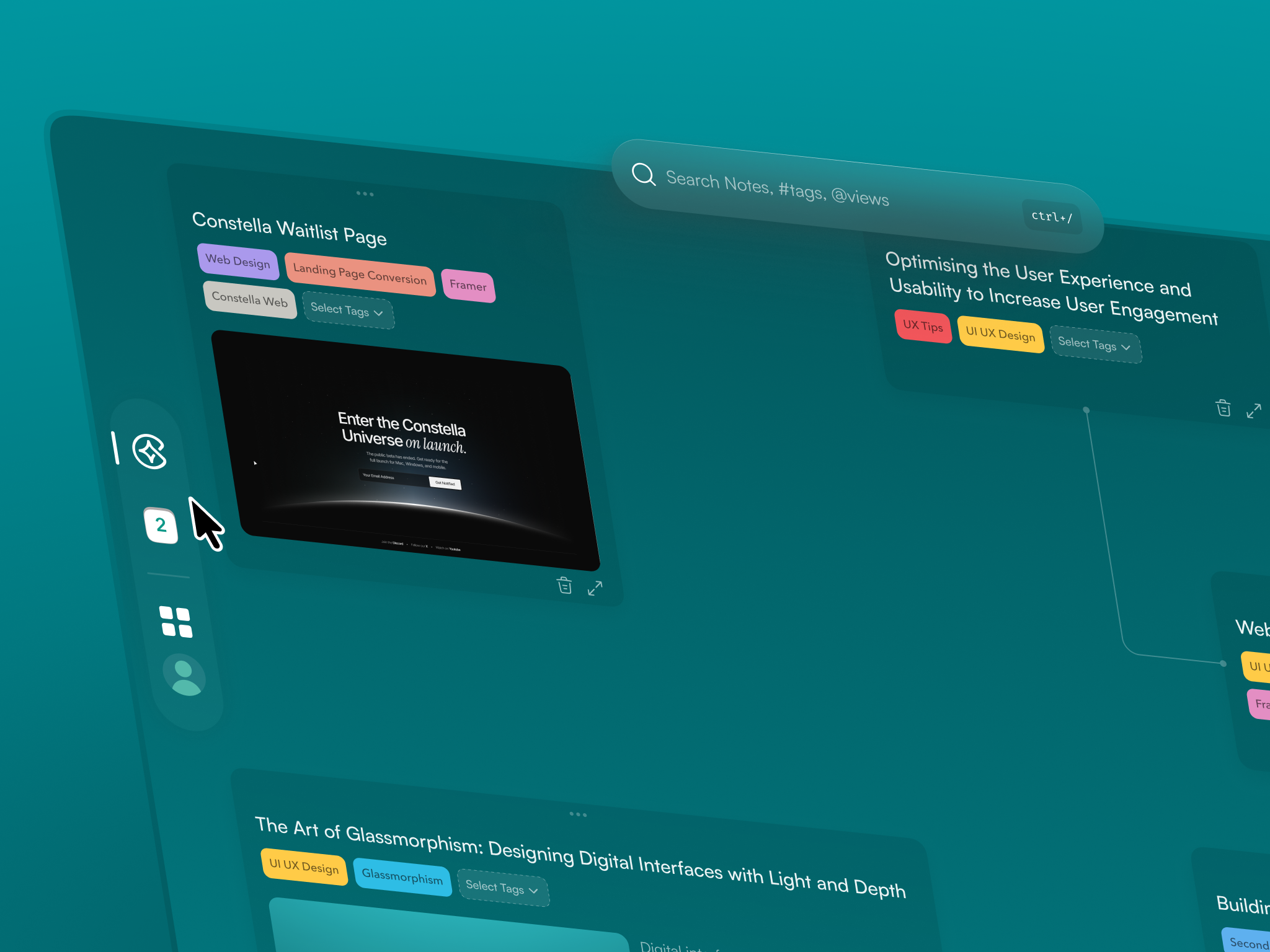
I moved navigation, journal, settings, command bar, saved views and sync into floating left and right sidebars that appear when needed. Card actions became contextual rather than persistent. Cleaner connection curves, softer card depth and more predictable movement made relationships easier to read while leaving more room for actual thought.
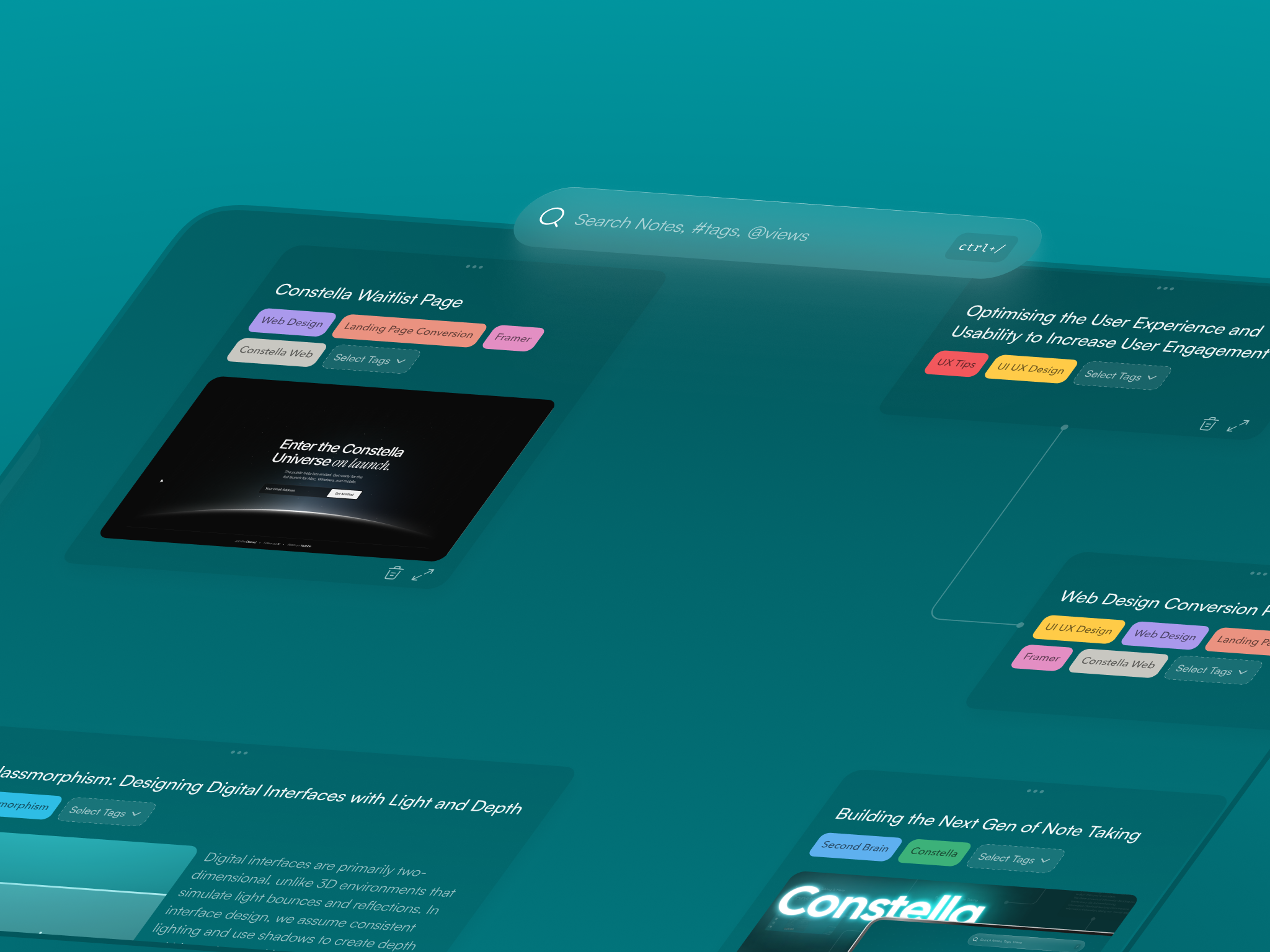
Semantic search was one of the strongest product capabilities, but it was hidden. I brought it into the centre as a floating glass search bar and delayed advanced sliders until the user begins typing. Search stopped feeling like a utility buried in navigation and became a direct way to move through the knowledge space.
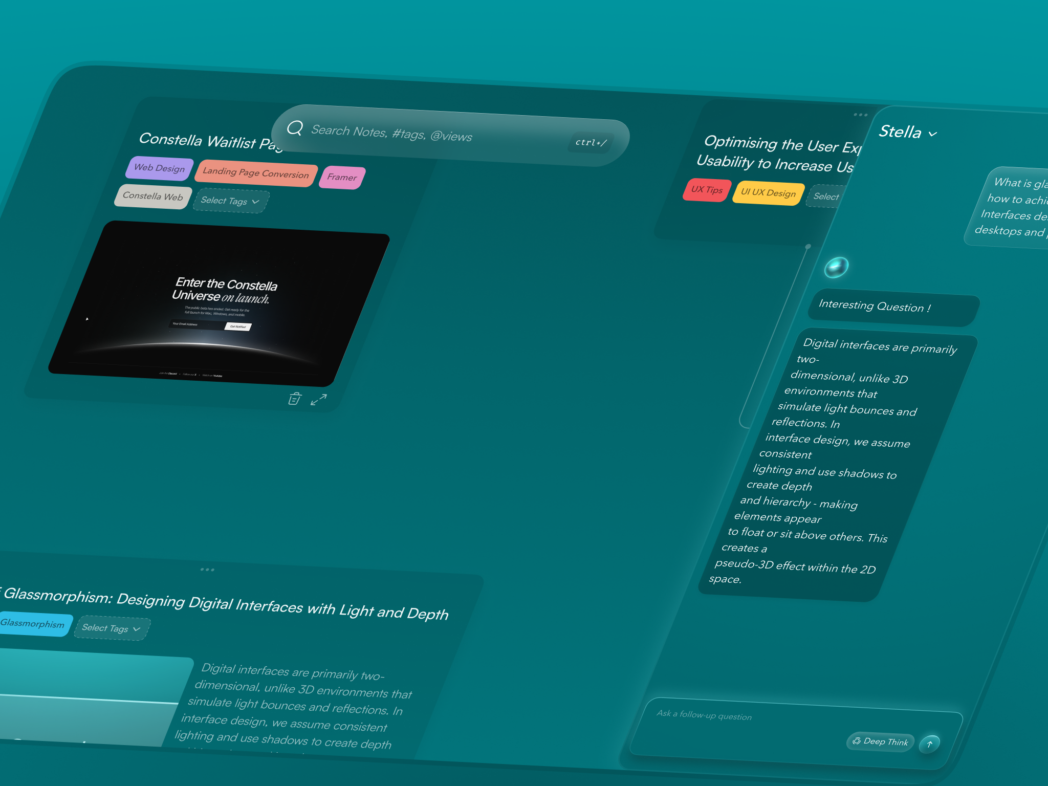
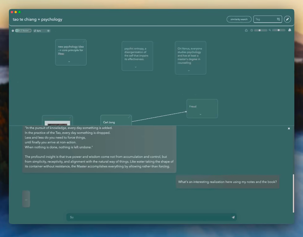
The original AI panel consumed more than half the vertical canvas. I reframed Stella as a right-side panel using roughly 40% of the width, so assistance could stay present without replacing the canvas. The product model became collaboration beside the work, not AI covering the work.
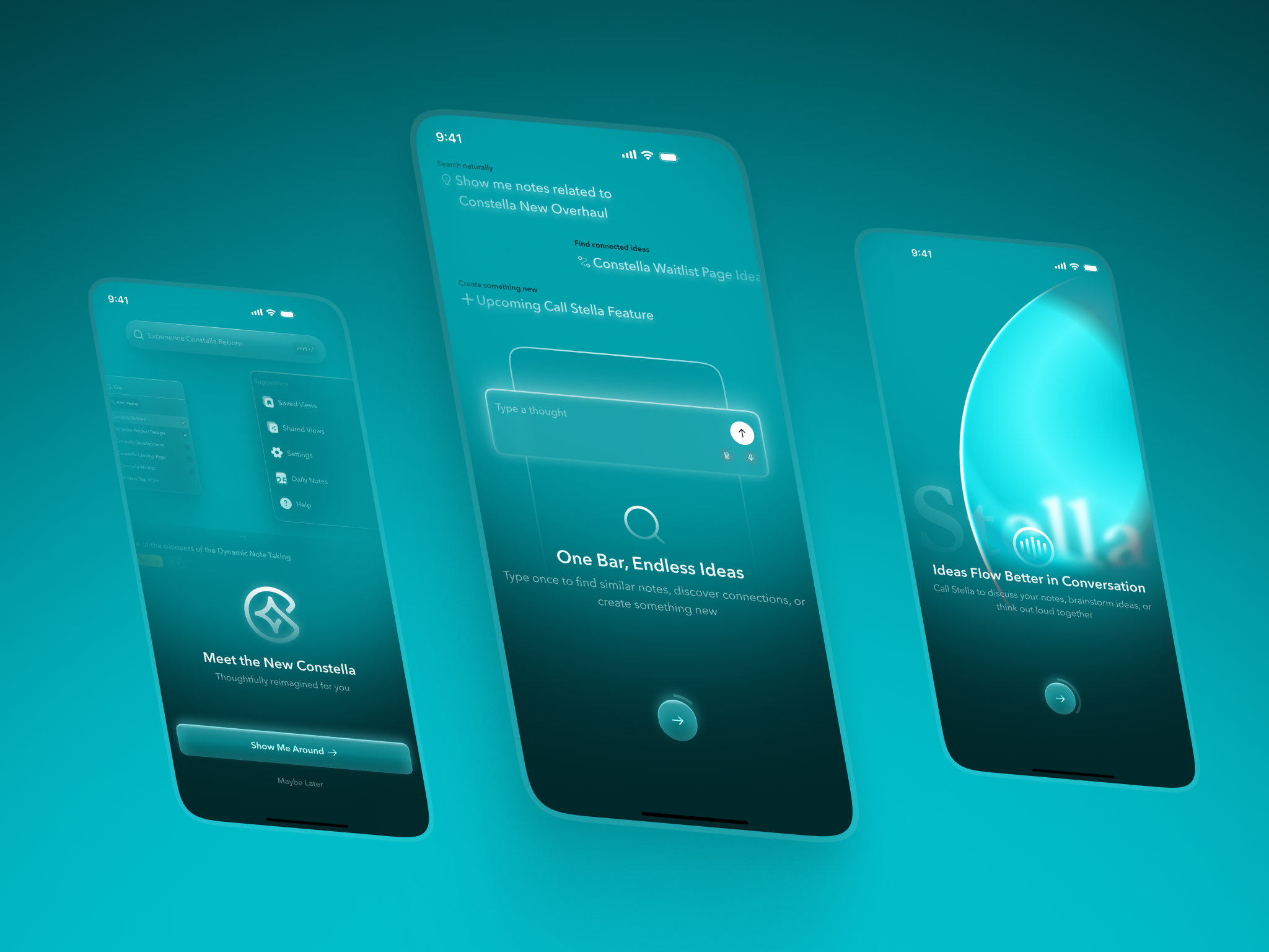
The mobile app was designed as a companion, not a reduced desktop canvas. I redesigned onboarding, login, pricing and fast capture, then introduced a handwritten-note scanner so ideas created away from the computer could enter the same knowledge system. This gave mobile a clear job: capture quickly now, organise and explore spatially later.
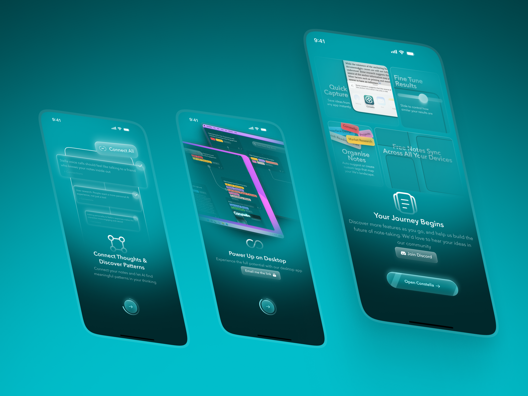
5. ALIGNING THE LAUNCH STORY
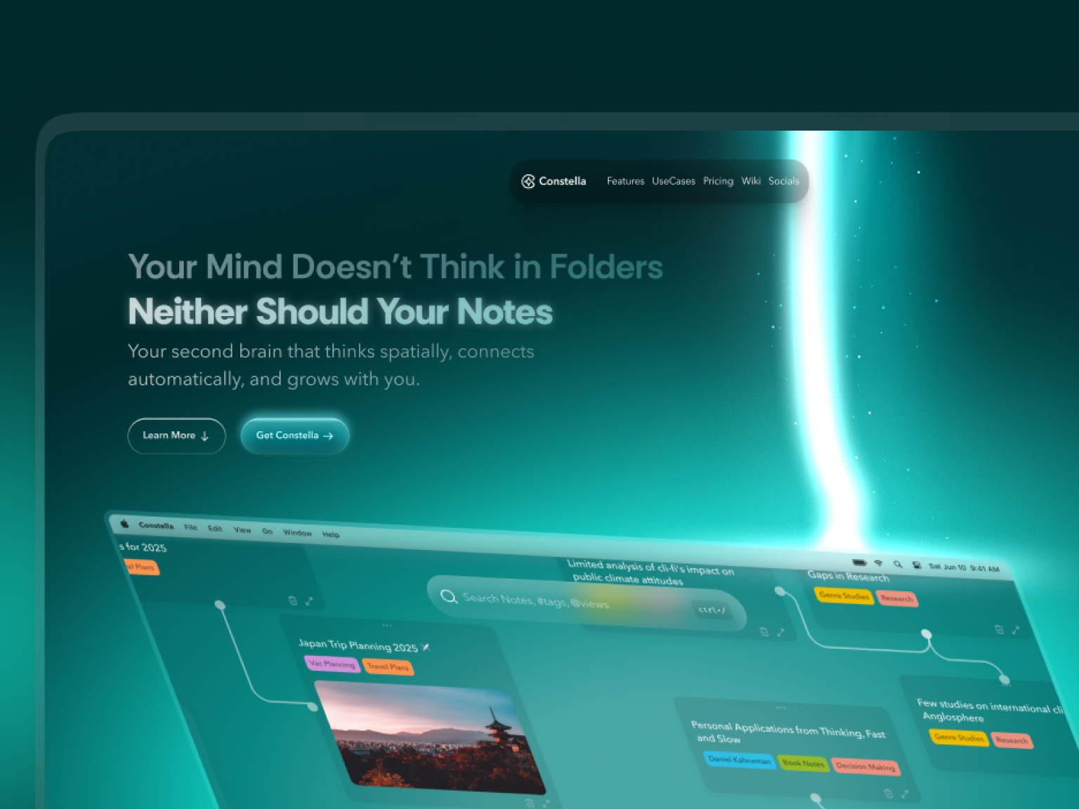
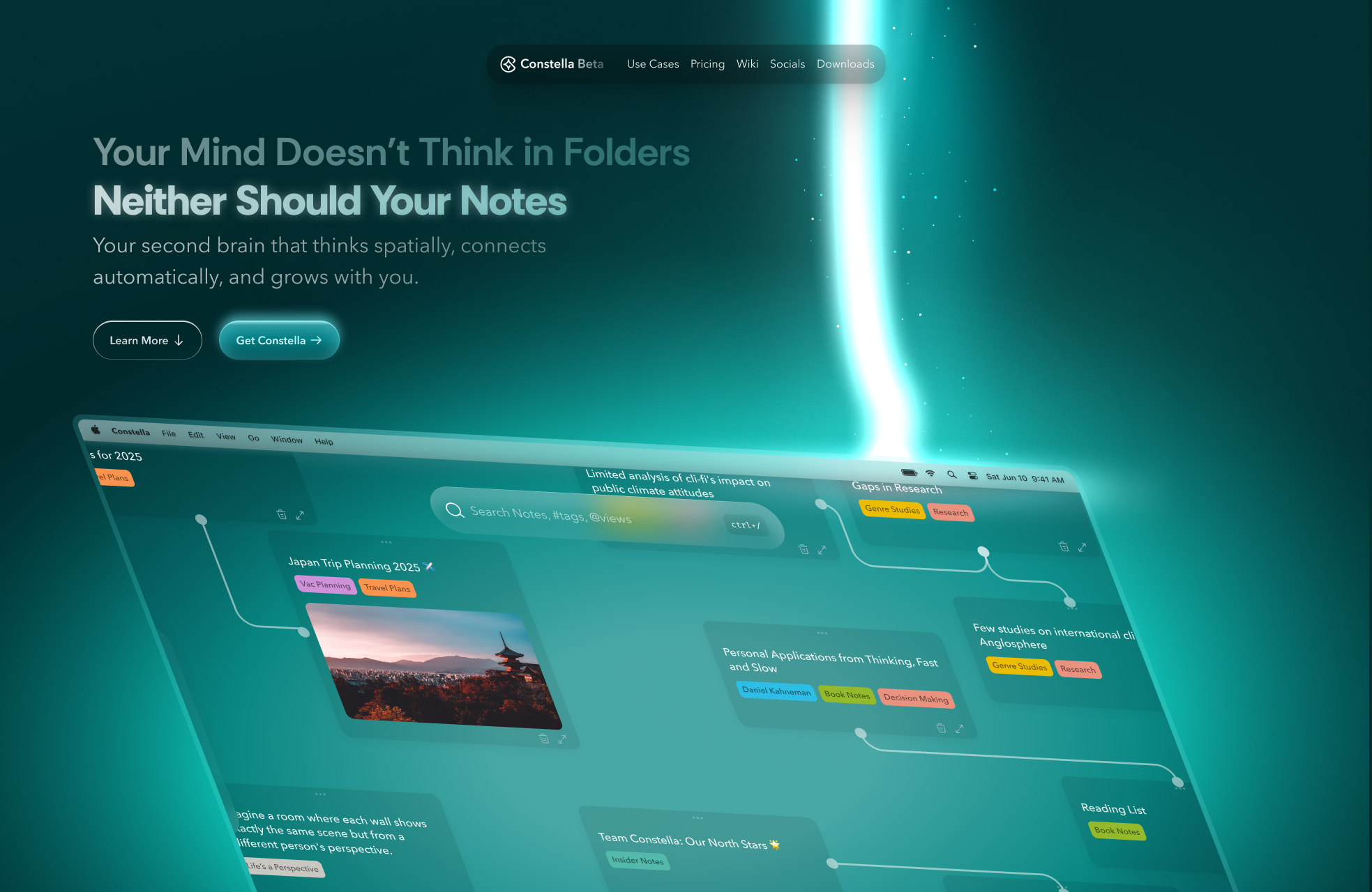
The product page needed to explain the experience as clearly as the product itself. I rebuilt the hero hierarchy, product visual and section flow; introduced aurora-green gradients and atmospheric depth; reduced visual noise; and created a calmer, more coherent brand expression across the landing page and footer.
I worked directly with the founders and engineering throughout product definition, specifications, implementation review and design QA. Reusable interaction and visual patterns helped desktop, mobile and marketing surfaces feel like one product rather than three disconnected projects.
WHAT THIS CASE STUDY COMBINES
• Desktop spatial canvas and information architecture
• Semantic search and AI-driven knowledge connections
• Stella AI interaction model
• Mobile onboarding, authentication, pricing and capture
• Handwritten-note scanning
• Cross-platform design-system patterns
• Launch-page positioning and visual storytelling
• Engineering collaboration and design QA
Result
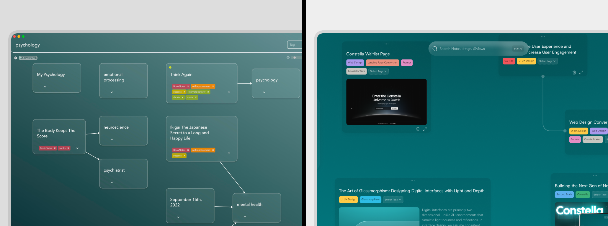
The result was a more coherent cross-platform product: a calmer desktop canvas, clearer information architecture, search and AI positioned as core thinking tools, a mobile companion focused on activation and capture, and a launch page that communicated the same spatial, intelligent product promise.
The defensible impact is product coherence and implementation quality rather than an invented growth figure. The redesign reduced persistent interface competition, created clearer interaction priorities, and connected capture, search, AI and knowledge exploration across desktop and mobile. Previous portfolio versions included activation, search, churn and sentiment percentages without a retained metric matrix, so I have intentionally not carried those figures into this case study.
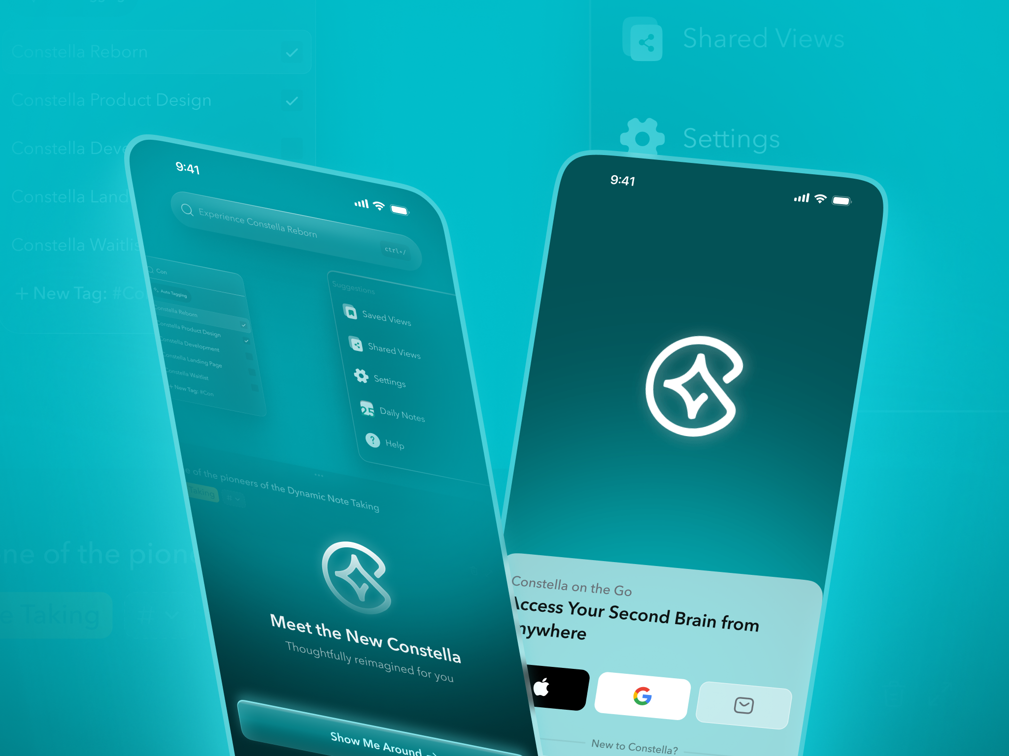
This work demonstrates my founding-level contribution across product definition, interaction design, visual systems, cross-platform activation, founder partnership and engineering QA, taking a developer-built MVP toward a market-ready AI knowledge product.